project //
Vehicle Discovery on Toyota.com - PLP, Filters, & Product Cards
Overview
Toyota.com is one of the highest-traffic consumer sites in the US, supporting roughly 25 million monthly users exploring vehicles across a broad and complex catalog. As the platform evolved, the vehicle listing experience wasn't keeping pace with how people actually shop.
This project focused on rethinking how users browse, filter, and compare vehicles, and building patterns scalable enough to grow with the platform. I led the product design team through it, from the filtering model to the comparison patterns and the system underneath them.
The Challenge
Vehicle shopping is a high-consideration journey. People compare models, trims, and features across multiple sessions before making a decision. The existing experience was creating friction at almost every step of that process.
Filtering was rigid and hard to navigate. Vehicle cards were inconsistent depending on where they appeared. Content hierarchy made side-by-side comparison harder than it needed to be. And the underlying patterns were becoming increasingly difficult for teams to maintain and extend.
The work also needed to serve two goals at once, helping customers make better decisions while supporting dealer lead generation through Toyota's distributed retail network.
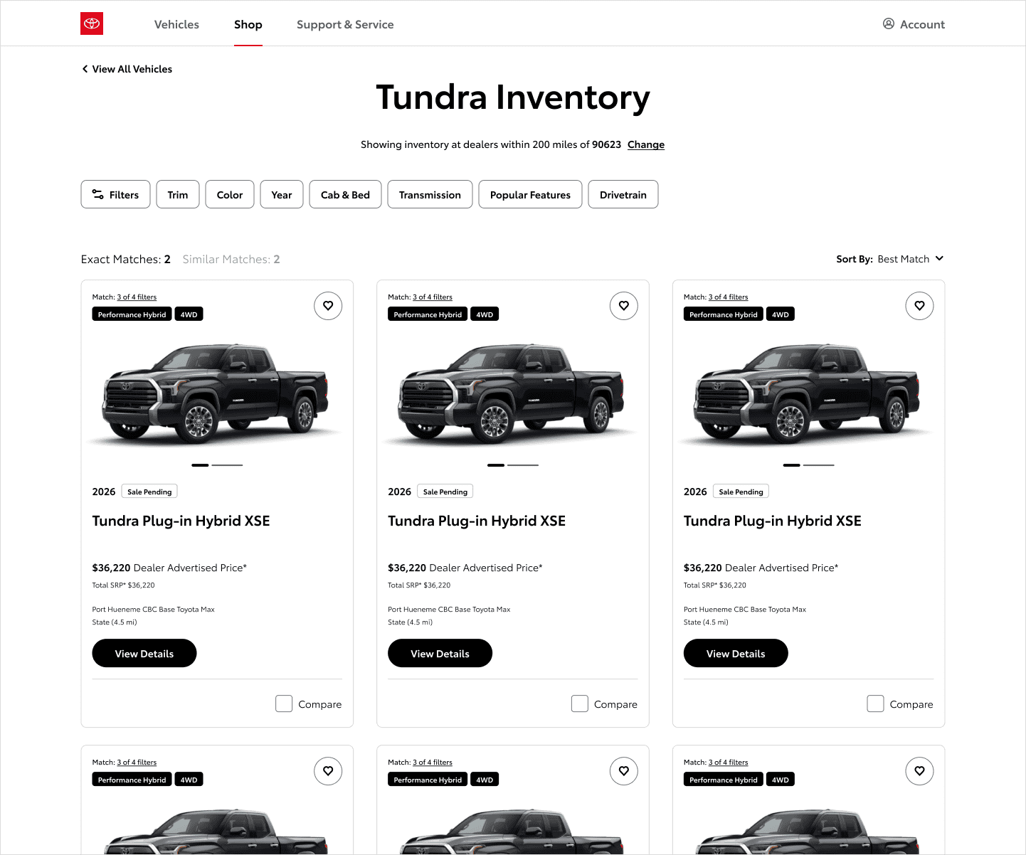
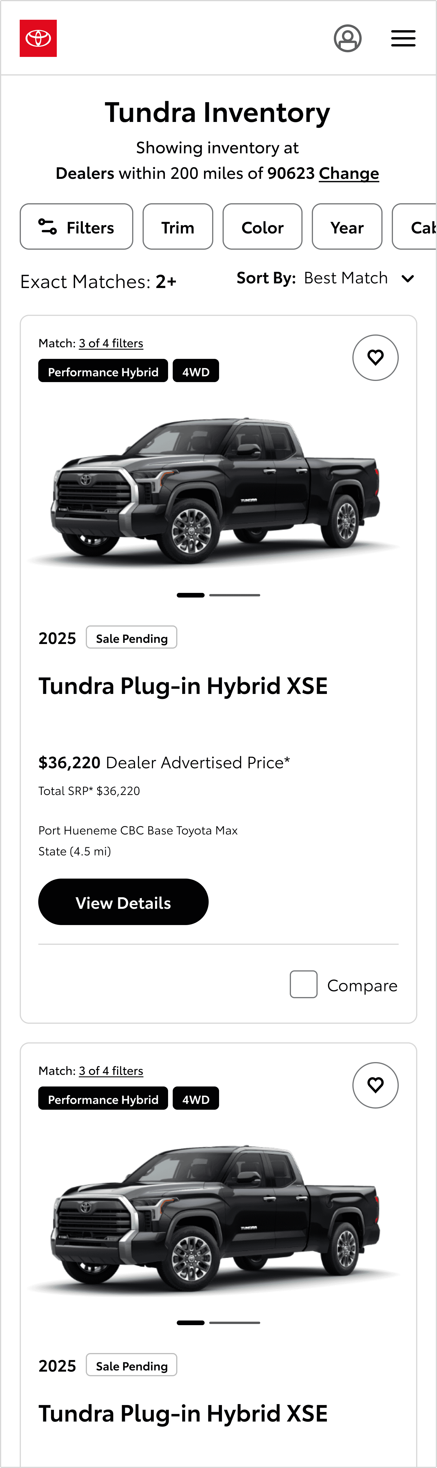
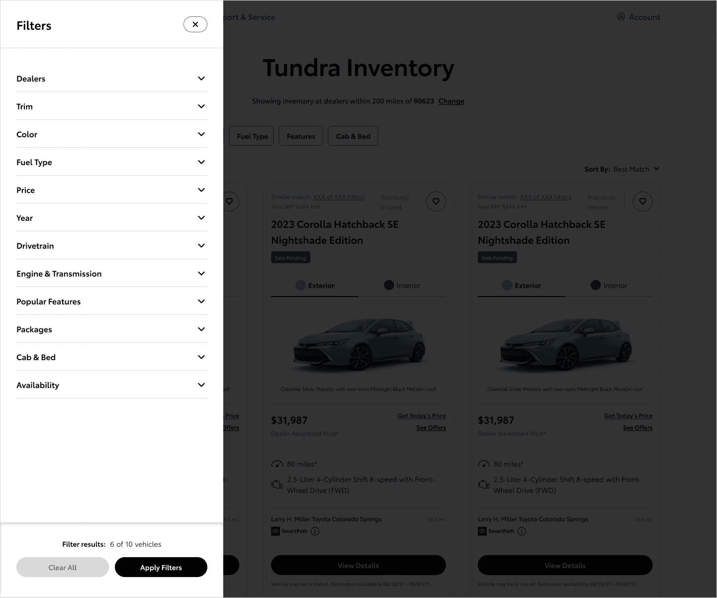
Filters Selected Indicator
We started by rethinking filtering from the ground up. The previous approach buried options and required too many steps to narrow results meaningfully. We redesigned the filter system to reduce friction, improve clarity, and let users get to the right vehicles faster.
High-value filters like trim and color were surfaced as individual selections rather than buried inside a collapsed panel. This reduced the number of steps between intent and result for the most common filtering behaviors. That meant deliberately not surfacing dozens of secondary filters up front, a bet that speeding up the common case mattered more than giving every filter equal weight.
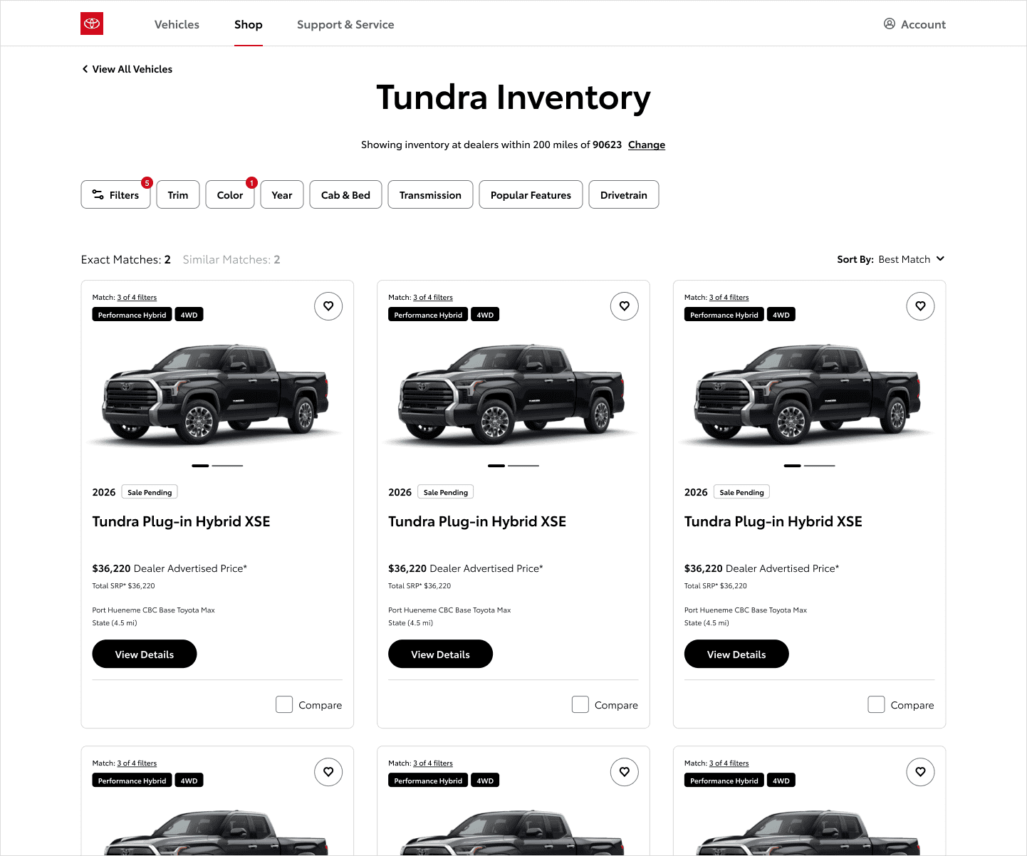
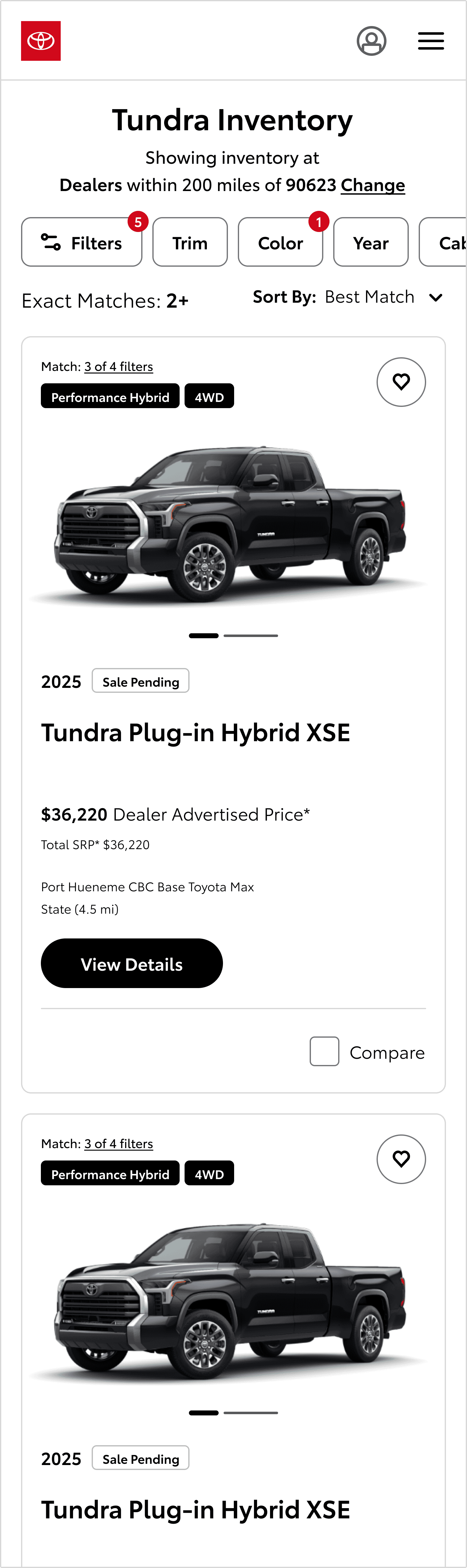
All Filters Open
The full filter panel was redesigned to feel organized rather than overwhelming, with a clearer hierarchy between filter categories and individual options.
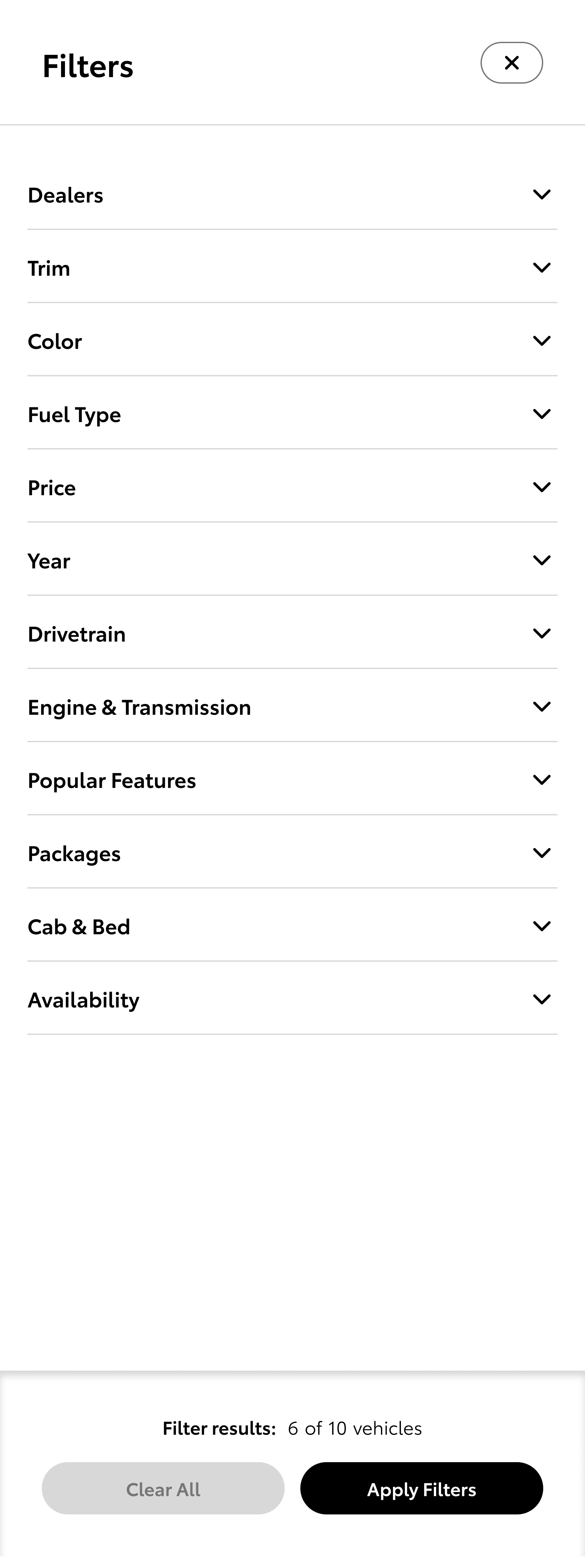
All Filters Expanded
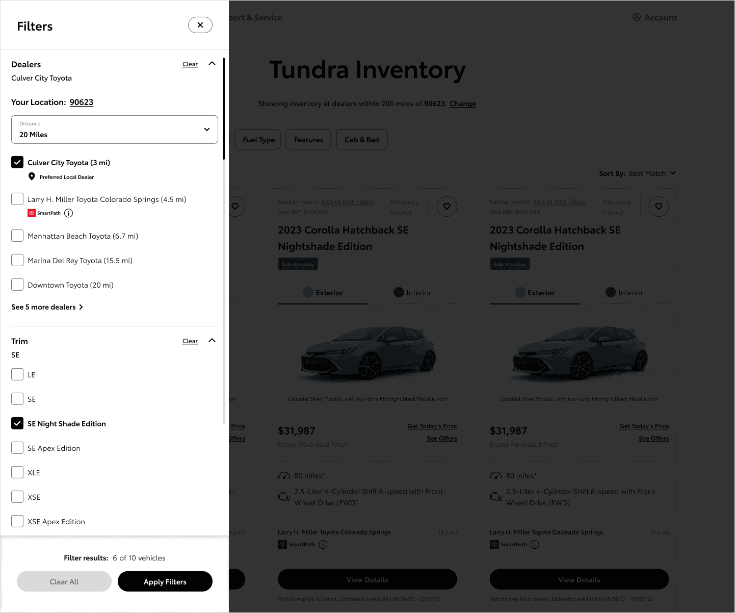
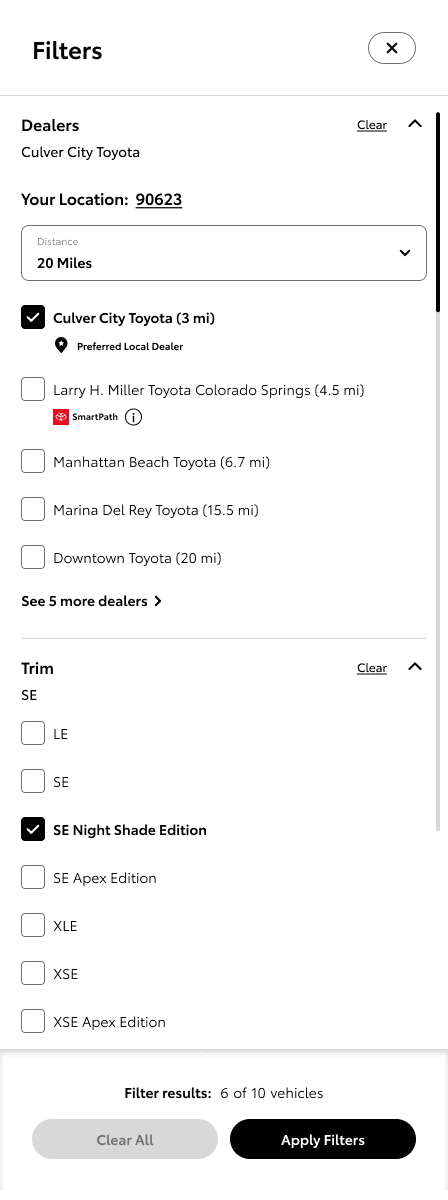
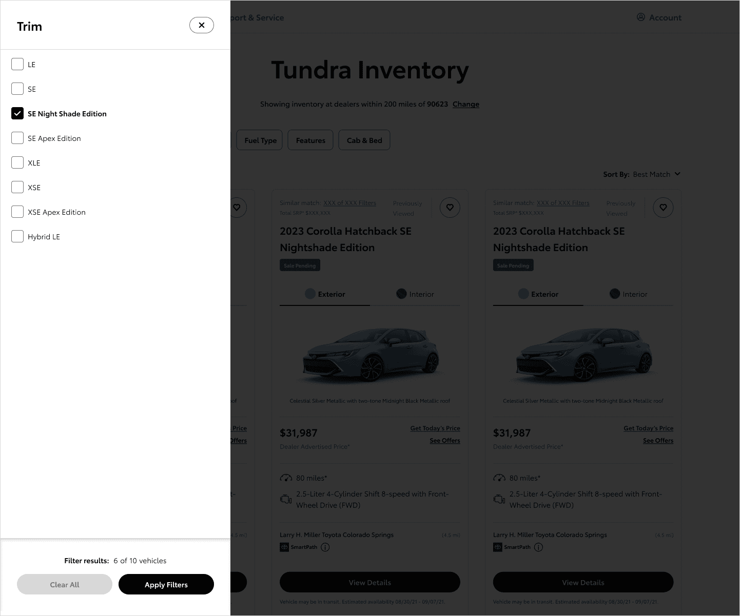
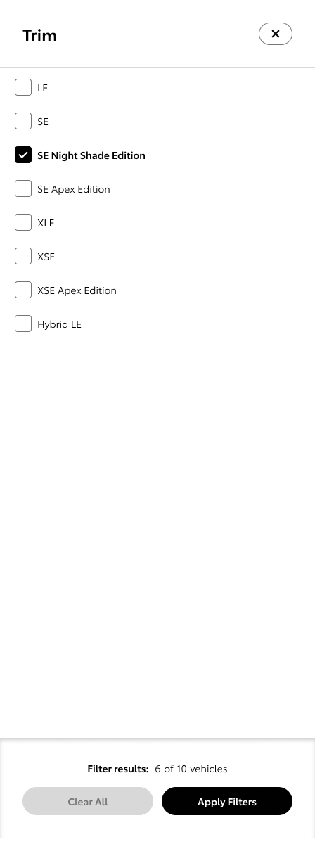
Individual High-Value Filters - Trim
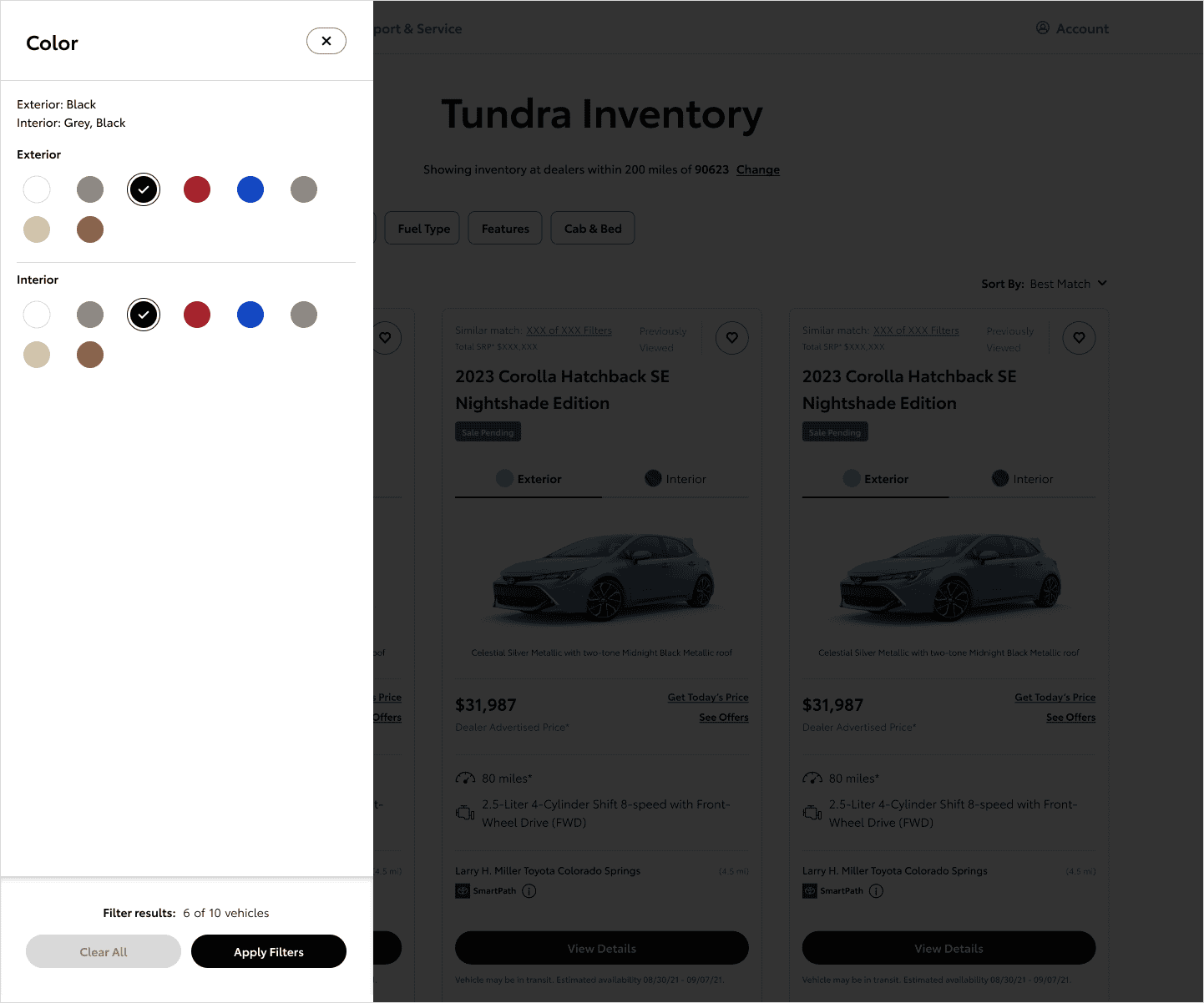
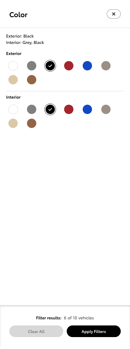
Trim and color were the two filters users reached for most. We gave them dedicated treatment, more visual, more scannable, and faster to interact with than a standard dropdown or checkbox list.
Individual High-Value Filters - Color
Product Thinking
This wasn't a one-time redesign. Toyota.com functions as an evolving product surface, so everything we built needed to support ongoing iteration and experimentation rather than lock the experience into a fixed state.
That meant working closely with product, engineering, and marketing throughout, aligning on priorities, pressure-testing assumptions against real user behavior, and making sure the patterns we created could adapt to future vehicle launches, campaigns, and business needs without starting from scratch every time.
The hardest decisions weren't design decisions. They were about where to draw the line between what users need in the moment and what the business needs over time. Getting those two things to point in the same direction is most of the work. The resolution wasn't to split the difference. A confident, well-informed customer is the best lead a dealer can get, so we built the lead-generation moments into the decision flow rather than bolting them on top of it. Getting the two to reinforce each other instead of compete was a huge chunk of the work.
Impact
• Improved clarity and consistency across vehicle discovery experiences
• Reduced friction in filtering and comparison flows
• Created reusable patterns that scaled more efficiently across teams
• Strengthened pathways between online exploration and dealer acquisition flows
• Established a more flexible foundation for future iteration and experimentation
Note: this work has completed user testing and has been handed off to engineering for implementation.