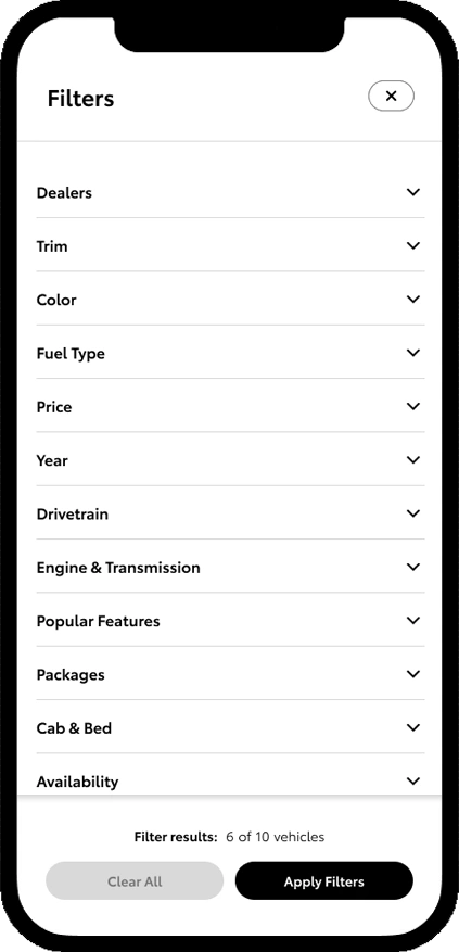
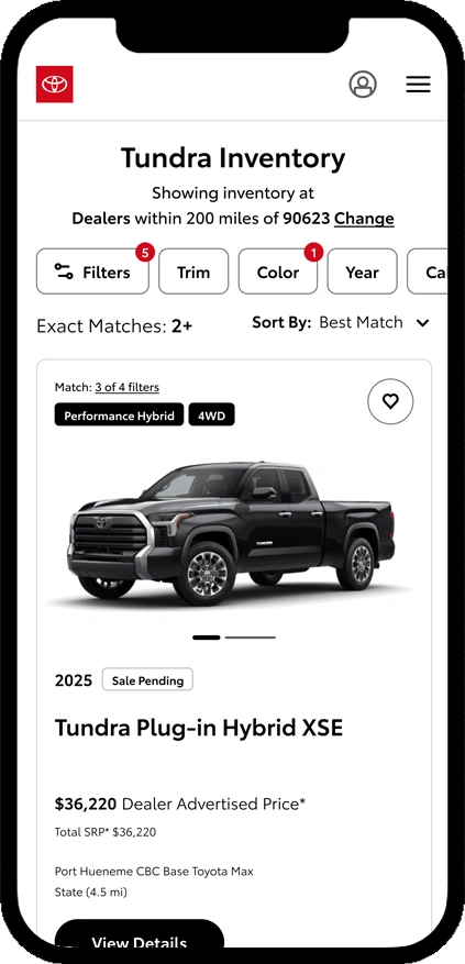
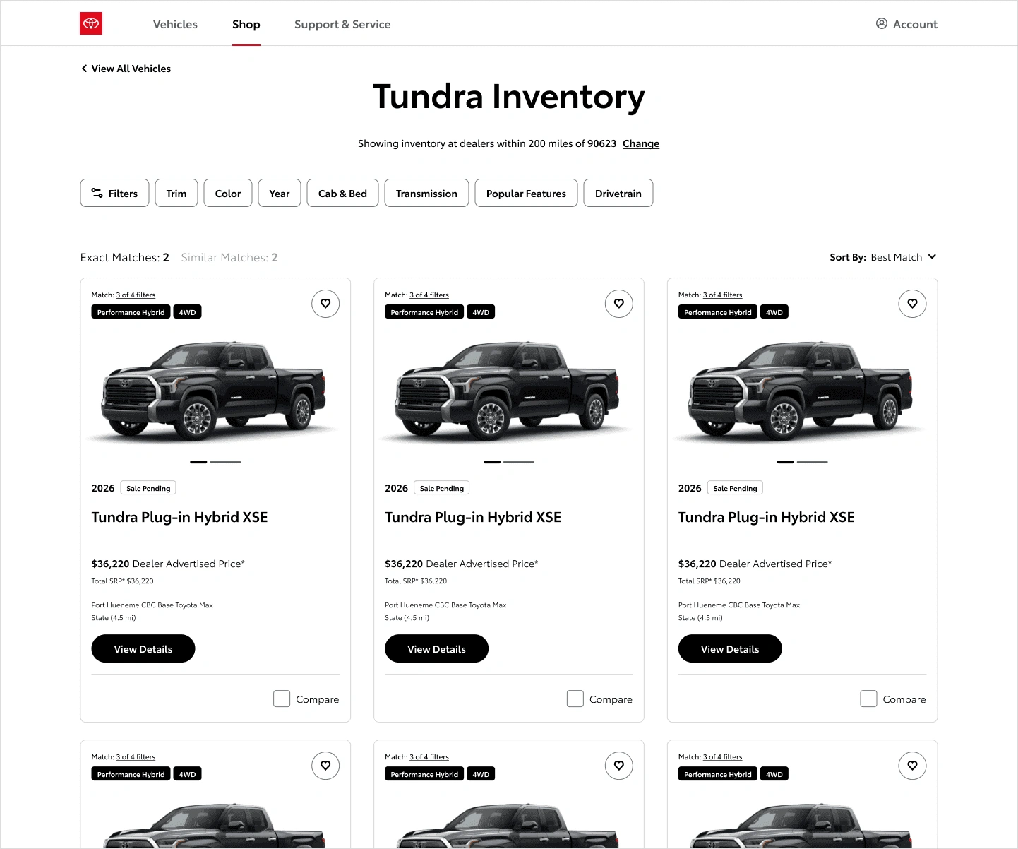
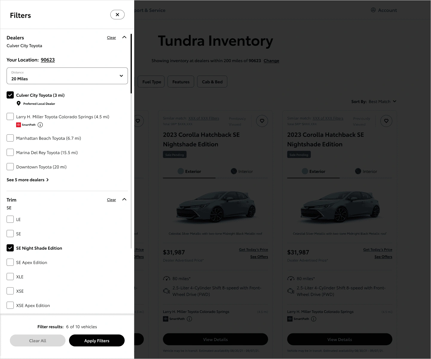
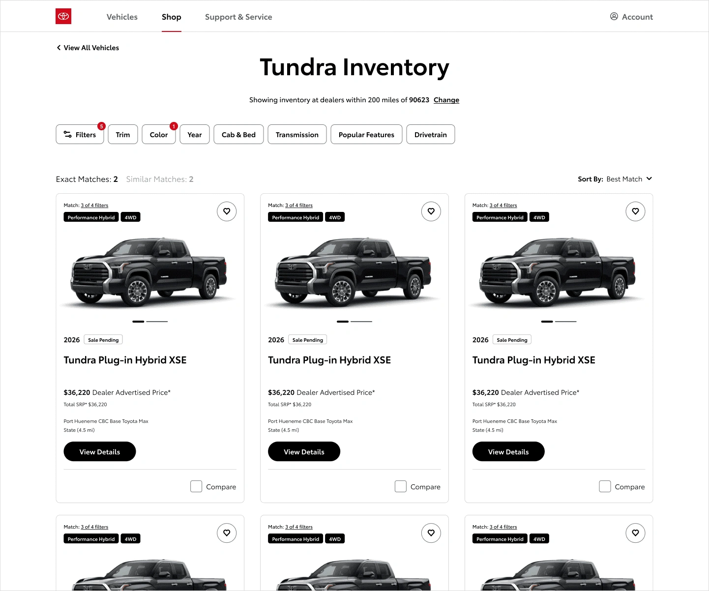
Vehicle shopping is a high-consideration journey. People compare models, trims, and features across multiple sessions before deciding. The existing experience fought them: filtering was rigid and buried, vehicle cards changed depending on where they appeared, and side-by-side comparison was harder than it needed to be.
The work also had to serve two goals at once: help customers make better decisions, and support dealer lead generation across Toyota's distributed retail network. Getting those two things to point in the same direction was most of the work.
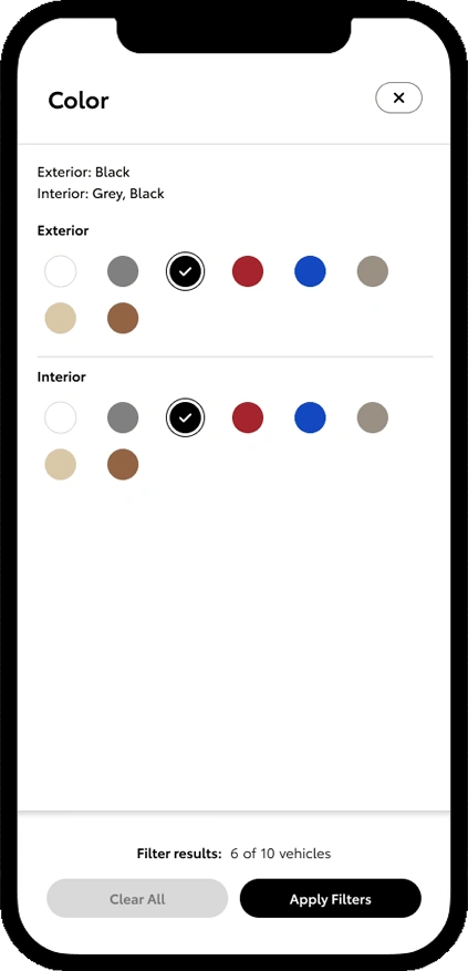
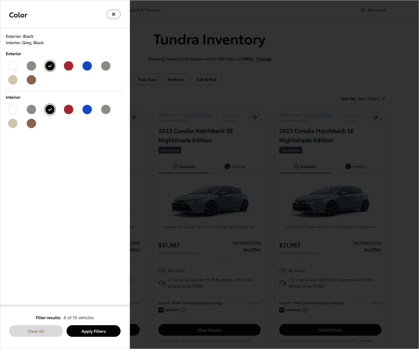
High-value filters like trim and color got dedicated, visual treatment instead of living in a collapsed panel. That meant deliberately not giving every filter equal weight, a bet that the common path mattered more.
Every card, filter, and module was designed for ongoing iteration and experimentation, so future vehicle launches and campaigns don't start from scratch.
A confident, well-informed customer is the best lead a dealer can get. We built lead-generation moments into the decision flow instead of bolting them on top of it.
The redesign simplified filtering and comparison, brought consistency to vehicle cards across the site, and created reusable patterns teams can extend without fragmenting the experience. It's completed user testing and is with engineering for implementation.
The underlying shift matters as much as the screens. Toyota.com works as an evolving product surface, and these patterns were built to adapt as the lineup, campaigns, and business needs change underneath them.