project //
Godzilla.com Redesign - Commerce Experience Redesign
Overview
Godzilla has one of the most passionate fan bases in entertainment. Toho America's ecommerce site wasn't keeping pace with that energy or the growing demand it was driving.
The experience felt unfinished. Typography was oversized and unbalanced. The navigation made it hard to find what you were looking for. The product catalog, spanning collectibles, apparel, and single-SKU items, was being forced through a one-size-fits-all layout that served none of those product types particularly well.
The goal was to build a shopping foundation that felt worthy of the brand while actually working for the people buying from it.
My Role
I led UX and experience design across the full redesign, covering navigation architecture, taxonomy, product discovery, filtering systems, and PDP design. I worked closely with Toho America stakeholders to balance brand direction with commerce goals and real user behavior.
Navigation
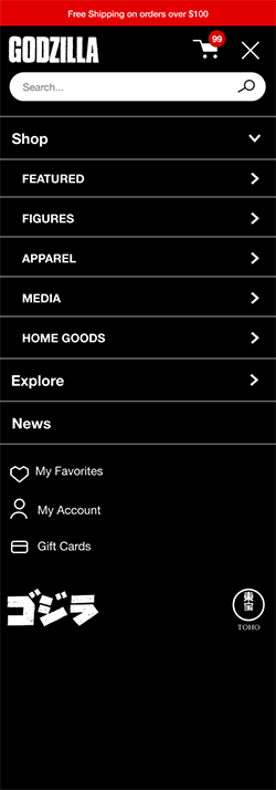
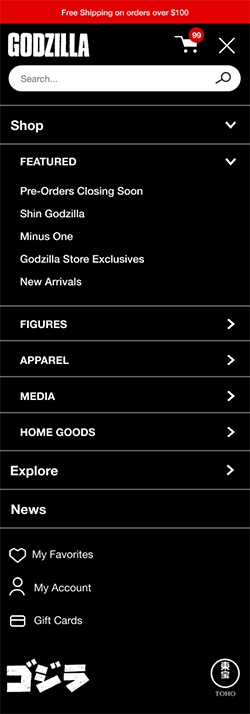
The previous navigation structure created friction at the first step. Categories were hard to find and the hierarchy didn't reflect how people actually shopped the catalog.
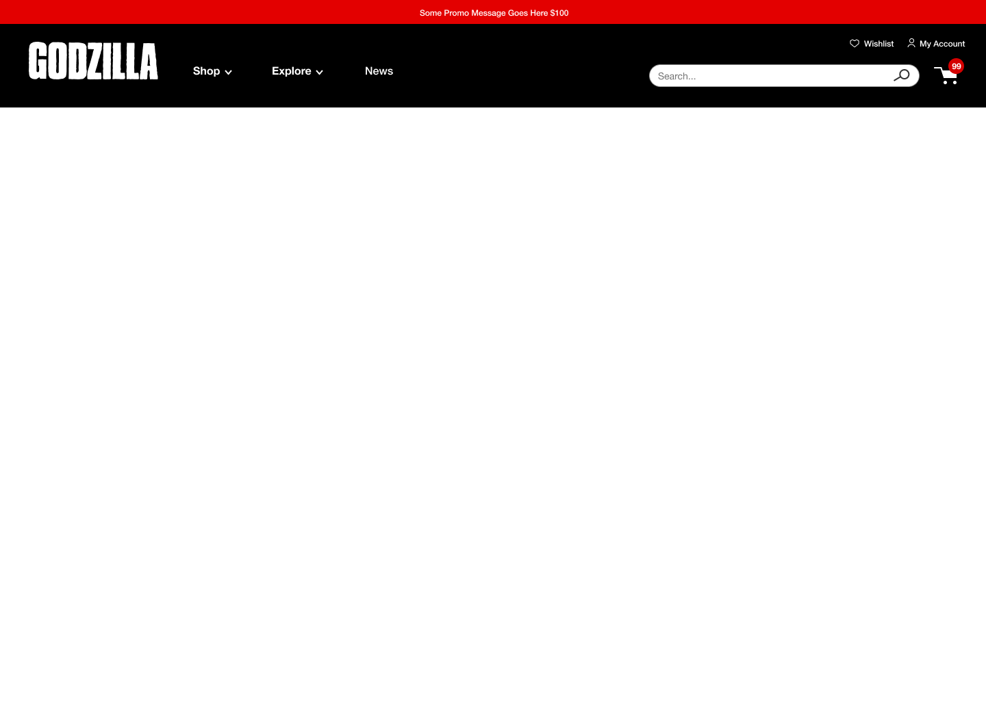
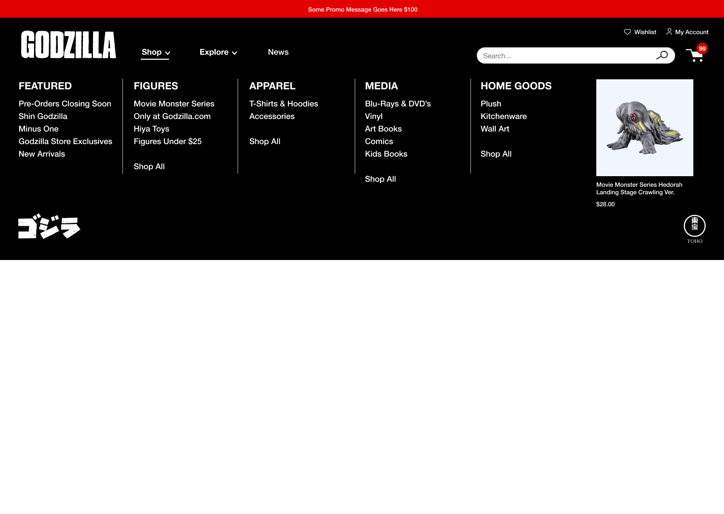
We rebuilt the mobile and desktop navigation systems from the ground up. Mobile uses an accordion structure with persistent search so users can move through categories without losing their place. Desktop introduces a structured mega navigation that gives the full catalog more visibility and makes browsing across categories faster.
The underlying taxonomy was restructured alongside the navigation so the two worked together, making it easier for users to find the products they were looking for.


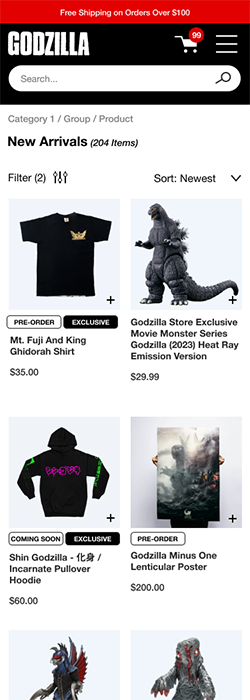
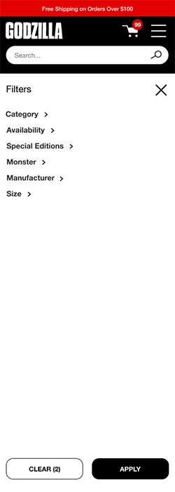
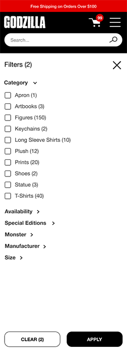
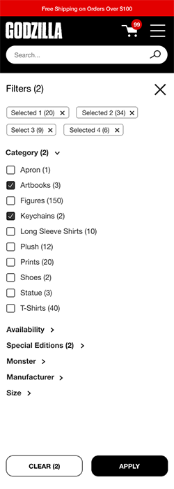
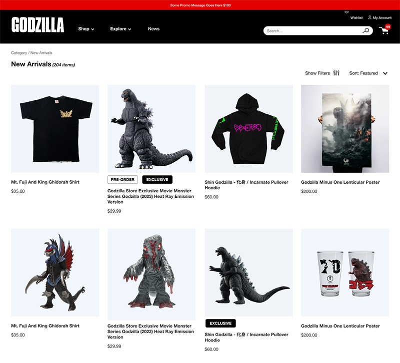
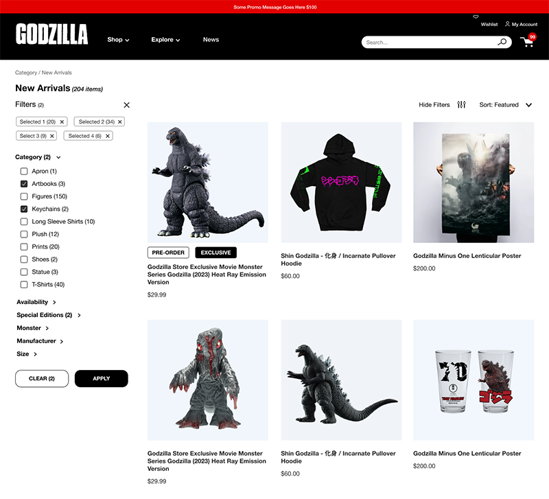
Product Listing Page & Filters
A catalog that spans collectibles, apparel, and licensed goods needs filtering that can handle real variety without overwhelming the person using it.
On mobile, filters open in a focused full-screen layer with anchored action controls so users stay oriented while making selections. On desktop, applying filters dynamically shifts the grid rather than refreshing the page, keeping products in view while the results update.
The goal throughout was to give users enough control to find what they were looking for without the filtering experience becoming the experience.
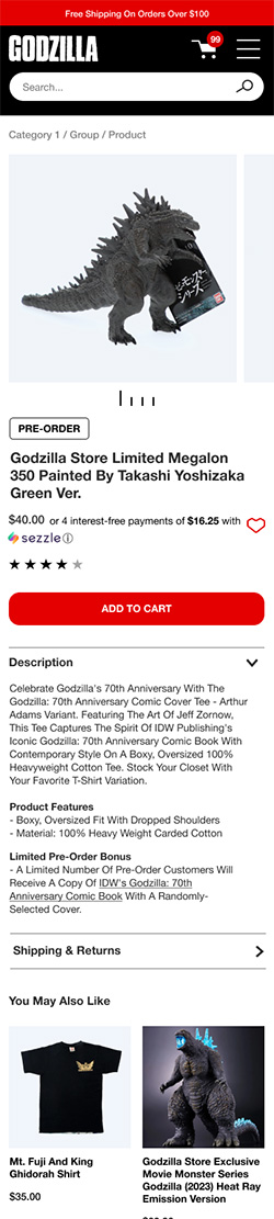
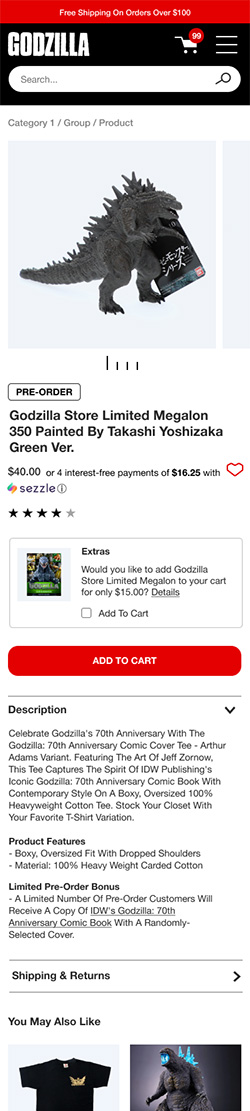
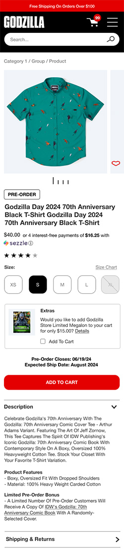
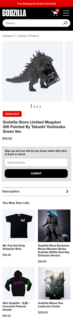
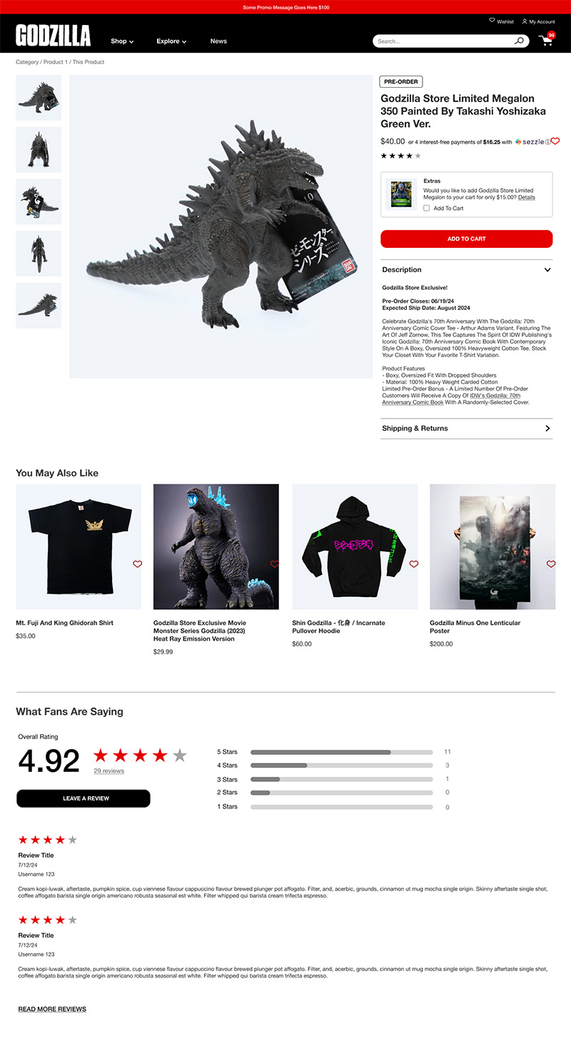
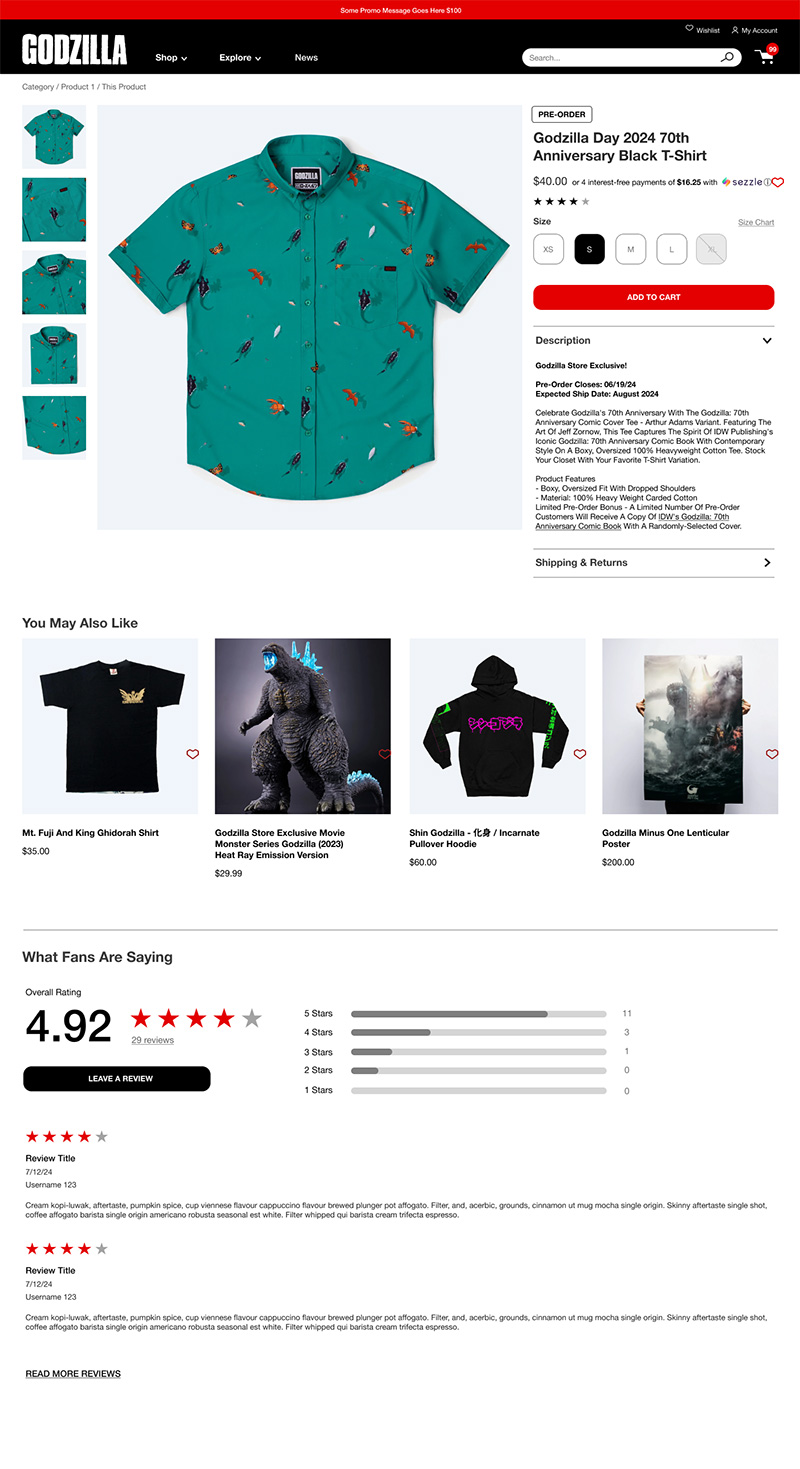
Product Detail Page
The PDP was where the catalog complexity was most visible. A limited-edition collectible, a size-run apparel item, a single-SKU figure, and a sold-out product with a restock notification all have different needs. The previous approach tried to handle all of them with the same layout and it showed.
We designed a modular PDP framework that could flex across product types without fragmenting into completely different templates. The layout adapts based on what the product needs, size selectors, upsell modules, restock workflows, while keeping the core experience consistent enough to feel like one site.
Impact
• Rebuilt navigation architecture and taxonomy to support a diverse and growing catalog
• Reduced discovery friction across mobile and desktop through clearer hierarchy and filtering
• Designed a flexible PDP framework supporting four distinct product types within a single consistent layout
• Established a scalable commerce foundation for a brand with a passionate and growing fanbase